In bootstrap, the toast component is same as the popover to show the notification messages with a customized alert box style for a couple of seconds when the user clicks on an element or performs any other action.
The bootstrap toast notification can be initialized with toast() method and it will close automatically after 500 milliseconds (0.5 seconds) in case if you don’t specify autohide: false property.
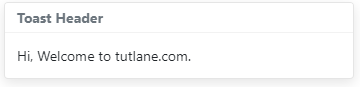
To create toast notification, first, create <div> element with .toast class, inside of it create another two <div> elements with .toast-header and .toast-body like as shown below.
In bootstrap, the custom-style toast notifications can be triggered with jQuery. So, you need to import the following script to initialize the toasts.
The above script will initialize all the toasts on a page with .toast class. If you want to show the toast for a particular element, then call toast('show') method with the id or class of a particular element.
The above example will return the result as shown below.
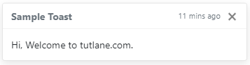
As discussed, the bootstrap toasts will close automatically after 500 milliseconds (0.5 seconds). In case if you want to show the toast, you need to add data-autohide="false" attribute to your .toast class <div> element to override the default auto-hide behavior of toast.
Same way, to close the toast notification, you need to add data-dismiss="toast" to <button> element like as shown below.
The above example will return the result as shown below.
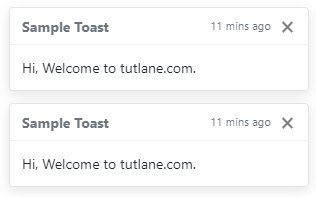
If you observe the above examples, we used different classes like mr-auto, ml-2, mb-1 to add required margins. In the next chapters, you can learn more about it.
In bootstrap, you can change the placement of toasts to the middle or right by using custom positioning CSS styles.
The above example will return the result as shown below.
In bootstrap, you can pass the different options to toast() method to customize the toast based on your requirements.
Following are the few important options which we can pass to toast() method in bootstrap.
| Name | Type | Default | Description |
|---|---|---|---|
| animation | boolean | true | It is useful to set CSS fade transition to the toast. |
| autohide | boolean | true | It is useful to auto-hide the toast. |
| delay | number | 500 | It is useful to delay hiding the toast (ms). |
The above toast options can set either through the data attributes or JavaScript. In the above examples, we already used data-autohide = "false" etc., properties based on our requirements.
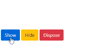
Same like above toast options, we have different toast() methods to show, hide, or toggle the toasts based on our requirements.
| Method | Description |
|---|---|
| .toast(options) | It is useful to attach toast options. |
| .toast('show') | It is useful to show the toast |
| .toast('hide') | It is useful to hide the toast |
| .toast('dispose') | It is useful to hide and destroy the toast |
Following is the example of using toast() methods to show, hide, or dispose the toast based on the button clicks in bootstrap.
The above example will return the result as shown below.
In bootstrap, the popover classes have few events for hooking into popover functionality to fire the events during the showing or hide the popovers.
| Event | Description |
|---|---|
| show.bs.toast | This event will trigger before the toast is shown. |
| shown.bs.toast | This event will trigger after the toast is shown. |
| hide.bs.toast | This event will trigger before the toast is hidden. |
| hidden.bs.toast | This event will trigger after the toast is hidden |
Following is the example of using the events to show the alert message while showing and hiding the toast in bootstrap.
This is how we can use the bootstrap toasts in our applications to show the notification messages with a customized alert box style based on our requirements.