In bootstrap, the media object is useful for building repetitive components such as blog comments, tweets, etc., to show the media objects (images or videos) and the content.
In bootstrap, we can create the media object by using .media and .media-body classes. We need to add .media class to the container element and add .media-body class to the child container, which will hold the media content.
While creating the media object, you need to add padding and margins based on your requirements with spacing utilities.
Following is the example of creating the media object in bootstrap.
Live Preview <div class="media border p-3">
<img class="mr-3" src="/images/defaultimg.png" alt="Suresh Dasari" style="width:80px;">
<div class="media-body">
<h5>Suresh Dasari<small><i> Posted on January 15, 2020</i></small></h5>
<p>Nice tutorial on bootstrap. Every bootstrap topic covered in-detail with examples.</p>
</div>
</div>
The above example will return the result as shown below.

If you want to align the media image right side, you need to add the image after .media-body container like as shown below.
<div class="media border p-3">
<div class="media-body">
<h5>Suresh Dasari<small><i> Posted on January 15, 2020</i></small></h5>
<p>Nice tutorial on bootstrap. Every bootstrap topic covered in-detail with examples.</p>
</div>
<img class="mr-3" src="/images/defaultimg.png" alt="Suresh Dasari" style="width:80px;">
</div>
The above example will return the result as shown below.

You can also change the media image style to a circle or rounded corner by adding .rounded or .rounded-circle classes to the media image object like as shown below.
<div class="media border p-3">
<img class="mr-3 rounded-circle" src="https://www.tutlane.com/images/defaultimg.png" alt="Suresh Dasari">
<div class="media-body">
<h5>Suresh Dasari<small><i> Posted on January 15, 2020</i></small></h5>
<p>Nice tutorial on bootstrap. Every bootstrap topic covered in-detail with examples.</p>
</div>
</div>
The above example will return the result as shown below.

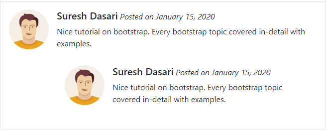
Bootstrap Nested Media Object
In bootstrap, you can create nested media objects like comments in social media or blogs comments by including multiple media objects inside of another media object.
To nest media object, you need to add nested .media object within the .media-body of a parent object like as shown below.
Live Preview <div class="media border p-3">
<img class="mr-3 rounded-circle" src="/images/defaultimg.png" alt="Suresh Dasari" style="width:80px;">
<div class="media-body">
<h5>Suresh Dasari<small><i> Posted on January 15, 2020</i></small></h5>
<p>Nice tutorial on bootstrap. Every bootstrap topic covered in-detail with examples.</p>
<div class="media p-3">
<img class="mr-3 rounded-circle" src="/images/defaultimg.png" alt="Suresh Dasari" style="width:80px;">
<div class="media-body">
<h5>Suresh Dasari<small><i> Posted on January 15, 2020</i></small></h5>
<p>Nice tutorial on bootstrap. Every bootstrap topic covered in-detail with examples.</p>
</div>
</div>
</div>
</div>
The above example will return the result as shown below.

Bootstrap Media Object Alignment
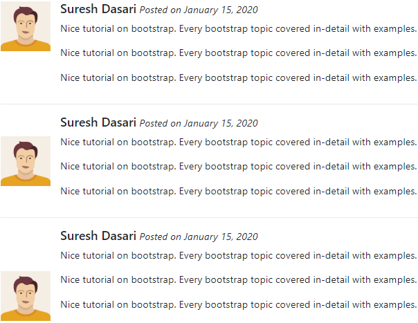
In bootstrap media object, you can change the alignment of media (image or video) to top, middle or bottom of your .media-body content using flex utility (.align-self-start, .align-self-center, and .align-self-end) classes.
Live Preview <!--Top Aligned media-->
<div class="media">
<img class="align-self-start mr-3" src="/images/defaultimg.png" alt="Suresh Dasari" style="width:80px;">
<div class="media-body">
<h5>Suresh Dasari<small><i> Posted on January 15, 2020</i></small></h5>
<p>Nice tutorial on bootstrap. Every bootstrap topic covered in-detail with examples.</p>
</div>
</div>
<!--Center Aligned media-->
<div class="media">
<img class="align-self-center mr-3" src="/images/defaultimg.png" alt="Suresh Dasari" style="width:80px;">
<div class="media-body">
<h5>Suresh Dasari<small><i> Posted on January 15, 2020</i></small></h5>
<p>Nice tutorial on bootstrap. Every bootstrap topic covered in-detail with examples.</p>
</div>
</div>
<!--Bottom Aligned media-->
<div class="media">
<img class="align-self-end mr-3" src="/images/defaultimg.png" alt="Suresh Dasari" style="width:80px;">
<div class="media-body">
<h5>Suresh Dasari<small><i> Posted on January 15, 2020</i></small></h5>
<p>Nice tutorial on bootstrap. Every bootstrap topic covered in-detail with examples.</p>
</div>
</div>
The above example will return the result as shown below.

This is how we can use bootstrap media objects to build repetitive components such as blog comments, tweets, etc., based on our requirements.