In bootstrap, input groups are useful to extend the behavior of textual inputs, selects and custom file upload controls by appending the text, icon, or a button on either side of input fields as a help text.
To create input groups in bootstrap first, you need to create a container element (<div>) with .input-group class to wrap the textual input elements and add-on elements. After that, create another <div> element within the container with .input-group-prepend or .input-group-append class to append the add-on element before or after the input.
The .input-group-prepend class is useful to append the add-on elements before the input, whereas the .input-group-append class is useful to append the add-on elements after the input.
The add-on elements must be wrapped inside of <span> element with .input-group-text class for proper styling and rendering.
Live Preview <form>
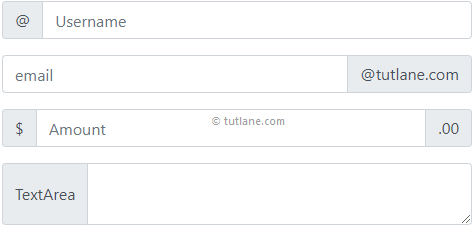
<div class="input-group mb-3">
<div class="input-group-prepend">
<span class="input-group-text">@</span>
</div>
<input type="text" class="form-control" placeholder="Username">
</div>
<div class="input-group mb-3">
<input type="email" class="form-control" placeholder="email">
<div class="input-group-append">
<span class="input-group-text">@tutlane.com</span>
</div>
</div>
<div class="input-group mb-3">
<div class="input-group-prepend">
<span class="input-group-text">$</span>
</div>
<input type="text" class="form-control" placeholder="Amount">
<div class="input-group-append">
<span class="input-group-text">.00</span>
</div>
</div>
<div class="input-group mb-3">
<div class="input-group-prepend">
<span class="input-group-text">TextArea</span>
</div>
<textarea class="form-control"></textarea>
</div>
</form>
If you observe the above example, we used .mb-3 utility class along with other input group classes. Here, the .mb-3 class is used to create a proper bottom margin for input group elements.
The above example will return the result as shown below.
Bootstrap Input Group with Multiple Inputs and Addons
In bootstrap, we can also create input groups with multiple inputs and add-ons.
Live Preview <form>
<div class="input-group mb-3">
<div class="input-group-prepend">
<span class="input-group-text">Search</span>
</div>
<input type="text" class="form-control" placeholder="First Name">
<input type="text" class="form-control" placeholder="Last Name">
</div>
<div class="input-group mb-3">
<div class="input-group-prepend">
<span class="input-group-text">Street</span>
<span class="input-group-text">City</span>
</div>
<input type="text" class="form-control" placeholder="Address">
</div>
</form>
The above example will return the result as shown below.

Bootstrap Input Groups Sizing
In bootstrap, we can resize the input groups to large or small by using .input-group-lg or .input-group-sm classes.
Live Preview <form>
<!--Small Size-->
<div class="input-group input-group-sm mb-3">
<div class="input-group-prepend">
<span class="input-group-text">Small</span>
</div>
<input type="text" class="form-control" placeholder="Username">
</div>
<!--Default Size-->
<div class="input-group mb-3">
<div class="input-group-prepend">
<span class="input-group-text">Default</span>
</div>
<input type="text" class="form-control" placeholder="email">
</div>
<!--Large Size-->
<div class="input-group input-group-lg mb-3">
<div class="input-group-prepend">
<span class="input-group-text">Large</span>
</div>
<input type="text" class="form-control" placeholder="Amount">
</div>
</form>
The above example will return the result as shown below.

Bootstrap Input Group with Checkboxes and Radios
In the previous input group example, we appended text to the input controls. Same way, we can also append the checkboxes and radios to input controls.
Live Preview <form>
<div class="input-group mb-3">
<div class="input-group-prepend">
<div class="input-group-text">
<input type="checkbox">
</div>
</div>
<input type="text" class="form-control" placeholder="Username">
</div>
<div class="input-group mb-3">
<div class="input-group-prepend">
<div class="input-group-text">
<input type="radio">
</div>
</div>
<input type="text" class="form-control" placeholder="email">
</div>
</form>
The above example will return the result as shown below.

Bootstrap Input Groups with Buttons
Same as checkboxes and radio buttons, you can also prepend or append the buttons to input controls.
Live Preview <form>
<div class="input-group mb-3">
<div class="input-group-prepend">
<button class="btn btn-primary" type="button" id="Button2">Search</button>
</div>
<input type="text" class="form-control" placeholder="Enter text to search">
</div>
<div class="input-group mb-3">
<input type="text" class="form-control" placeholder="Enter search text">
<div class="input-group-append">
<button class="btn btn-success" type="button" id="Button3">Search</button>
</div>
</div>
<div class="input-group mb-3">
<input type="text" class="form-control" placeholder="Enter username">
<div class="input-group-append">
<button class="btn btn-info" type="button" id="Button4">Go</button>
<button class="btn btn-danger" type="button" id="Button5">Cancel</button>
</div>
</div>
</form>
The above example will return the result as shown below.

Bootstrap Input Group with Button Dropdowns
Same as buttons, checkboxes, and radios, you can also prepend or append button dropdowns to input elements based on your requirements.
Live Preview <form>
<div class="input-group mb-3">
<div class="input-group-prepend">
<button type="button" class="btn btn-outline-secondary dropdown-toggle" data-toggle="dropdown">
Payment Dropdown
</button>
<div class="dropdown-menu">
<a class="dropdown-item" href="#">Net Banking</a>
<a class="dropdown-item" href="#">Credit Card</a>
<a class="dropdown-item" href="#">Wallets</a>
</div>
</div>
<input type="text" class="form-control" placeholder="Enter amount">
<div class="input-group-append">
<span class="input-group-text">$</span>
</div>
</div>
</form>
The above example will return the result as shown below.

Bootstrap Input Groups with Custom Select
In bootstrap, input groups included support for custom select to prepend or append input controls.
Live Preview <form>
<div class="input-group mb-3">
<div class="input-group-prepend">
<label class="input-group-text">Payment Type</label>
</div>
<select class="custom-select" id="Select1">
<option selected>Choose...</option>
<option value="1">Net Banking</option>
<option value="2">Credit Card</option>
<option value="3">Wallets</option>
</select>
<div class="input-group-append">
<span class="input-group-text">$</span>
</div>
</div>
</form>
The above example will return the result as shown below.

This is how the input groups are useful to extend the behavior of input controls by appending the text, icon, or a button on either side of input fields as a help text in bootstrap.