The bootstrap has provided classes to extend the default style of HTML tables. Using bootstrap table classes, we can add the colors to your table rows, table headers, etc., and also, we can create striped table rows, border rows, hover rows, etc., based on our requirements.
Bootstrap Standard Table
To change the default style of HTML table first, create a table and add bootstrap .table class to the table (<table>) element. The bootstrap .table class will add basic styling like cell padding (8px) and horizontal dividers to the table.
Live Preview <table class="table">
<thead>
<tr>
<th>First Name</th>
<th>Last Name</th>
<th>Tel No.</th>
<th>Email</th>
</tr>
</thead>
<tbody>
<tr>
<td>Peter</td>
<td>Mark</td>
<td>Not Available</td>
<td>Not Available</td>
</tr>
<tr>
<td>Peter</td>
<td>Mark</td>
<td>Not Available</td>
<td>Not Available</td>
</tr>
<tr>
<td>Peter</td>
<td>Mark</td>
<td>Not Available</td>
<td>Not Available</td>
</tr>
</tbody>
</table>
The above example will return the result as shown below.

We can also invert the colors of a table like the light text on dark background by adding .table-dark class in bootstrap.
Live Preview <table class="table table-dark">
<thead>
<tr>
<th>First Name</th>
<th>Last Name</th>
<th>Tel No.</th>
<th>Email</th>
</tr>
</thead>
<tbody>
<tr>
<td>Peter</td>
<td>Mark</td>
<td>Not Available</td>
<td>Not Available</td>
</tr>
<tr>
<td>Peter</td>
<td>Mark</td>
<td>Not Available</td>
<td>Not Available</td>
</tr>
<tr>
<td>Peter</td>
<td>Mark</td>
<td>Not Available</td>
<td>Not Available</td>
</tr>
</tbody>
</table>
The above example will return the result as shown below.

Bootstrap Striped Table Rows
By adding bootstrap .table-striped class to <table> element, we can create a table with alternate background colored rows like zebra-stripes.
Live Preview <table class="table table-striped">
<thead>
<tr>
<th>First Name</th>
<th>Last Name</th>
<th>Tel No.</th>
<th>Email</th>
</tr>
</thead>
<tbody>
<tr>
<td>Peter</td>
<td>Mark</td>
<td>Not Available</td>
<td>Not Available</td>
</tr>
<tr>
<td>Peter</td>
<td>Mark</td>
<td>Not Available</td>
<td>Not Available</td>
</tr>
<tr>
<td>Peter</td>
<td>Mark</td>
<td>Not Available</td>
<td>Not Available</td>
</tr>
</tbody>
</table>
The .table-striped class will add alternate background color to the table rows within the <tbody> element.
The above example will return the result as shown below.

Similarly, we can create a dark table with striped rows by adding .table-drak class with .table-striped class like as shown below.
Live Preview <table class="table table-dark table-striped">
<thead>
<tr>
<th>First Name</th>
<th>Last Name</th>
<th>Tel No.</th>
<th>Email</th>
</tr>
</thead>
<tbody>
<tr>
<td>Peter</td>
<td>Mark</td>
<td>Not Available</td>
<td>Not Available</td>
</tr>
<tr>
<td>Peter</td>
<td>Mark</td>
<td>Not Available</td>
<td>Not Available</td>
</tr>
<tr>
<td>Peter</td>
<td>Mark</td>
<td>Not Available</td>
<td>Not Available</td>
</tr>
</tbody>
</table>
The above example will return the result as shown below.

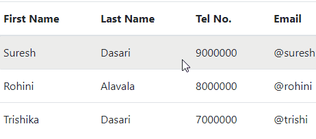
Bootstrap Table with Hoverable Rows
In bootstrap, we can add hover effect for the table rows within <tbody> element by adding .table-hover class. The .table-hover class will provide a light gray color on the hover of the row.
Live Preview <table class="table table-hover">
<thead>
<tr>
<th>First Name</th>
<th>Last Name</th>
<th>Tel No.</th>
<th>Email</th>
</tr>
</thead>
<tbody>
<tr>
<td>Suresh</td>
<td>Dasari</td>
<td>9000000</td>
<td>@suresh</td>
</tr>
<tr>
<td>Rohini</td>
<td>Alavala</td>
<td>8000000</td>
<td>@rohini</td>
</tr>
<tr>
<td>Trishika</td>
<td>Dasari</td>
<td>7000000</td>
<td>@trishi</td>
</tr>
</tbody>
</table>
The above example will return the result as shown below.
Similarly, we can create a dark-themed hoverable rows table by adding .table-dark class with .table-hover class as shown below.
Live Preview<table class="table table-dark table-hover">
<thead>
<tr>
<th>First Name</th>
<th>Last Name</th>
<th>Tel No.</th>
<th>Email</th>
</tr>
</thead>
<tbody>
<tr>
<td>Suresh</td>
<td>Dasari</td>
<td>9000000</td>
<td>@suresh</td>
</tr>
<tr>
<td>Rohini</td>
<td>Alavala</td>
<td>8000000</td>
<td>@rohini</td>
</tr>
<tr>
<td>Trishika</td>
<td>Dasari</td>
<td>7000000</td>
<td>@trishi</td>
</tr>
</tbody>
</table>
The above example will return the result as shown below.

Bootstrap Bordered Table
By using bootstrap .table-bordered class, we can add borders on every row and cell of the table.
Live Preview <table class="table table-bordered">
<thead>
<tr>
<th>First Name</th>
<th>Last Name</th>
<th>Tel No.</th>
<th>Email</th>
</tr>
</thead>
<tbody>
<tr>
<td>Suresh</td>
<td>Dasari</td>
<td>9000000</td>
<td>@suresh</td>
</tr>
<tr>
<td>Rohini</td>
<td>Alavala</td>
<td>8000000</td>
<td>@rohini</td>
</tr>
<tr>
<td>Trishika</td>
<td>Dasari</td>
<td>7000000</td>
<td>@trishi</td>
</tr>
</tbody>
</table>
The .table-bordered class will add borders on all sides of the table and cells. The above example will return the result like as shown below.

Bootstrap Borderless Table
By adding bootstrap .table-borderless class to <table> element, we can create a table without any borders.
Live Preview<table class="table table-borderless">
<thead>
<tr>
<th>First Name</th>
<th>Last Name</th>
<th>Tel No.</th>
<th>Email</th>
</tr>
</thead>
<tbody>
<tr>
<td>Suresh</td>
<td>Dasari</td>
<td>9000000</td>
<td>@suresh</td>
</tr>
<tr>
<td>Rohini</td>
<td>Alavala</td>
<td>8000000</td>
<td>@rohini</td>
</tr>
<tr>
<td>Trishika</td>
<td>Dasari</td>
<td>7000000</td>
<td>@trishi</td>
</tr>
</tbody>
</table>
The above example will return the result as shown below.

Bootstrap Table Header Colors
By adding .thead-light or .thead-dark class to the table header (<thead>), we can change the table header color to light or dark gray based on our requirements.
Live Preview<table class="table table-bordered">
<thead class="thead-dark">
<tr>
<th>First Name</th>
<th>Last Name</th>
<th>Tel No.</th>
<th>Email</th>
</tr>
</thead>
<tbody>
<tr>
<td>Suresh</td>
<td>Dasari</td>
<td>9000000</td>
<td>@suresh</td>
</tr>
<tr>
<td>Rohini</td>
<td>Alavala</td>
<td>8000000</td>
<td>@rohini</td>
</tr>
<tr>
<td>Trishika</td>
<td>Dasari</td>
<td>7000000</td>
<td>@trishi</td>
</tr>
</tbody>
</table>
The above example will return the result as shown below.

Same way, if you want a light gray color header, apply .thead-light class on table header (<thead>).
Bootstrap Table with Contextual Classes
The bootstrap contextual classes such as success, info, warning, etc. can use on rows (<tr>) and cells (<td>) of a table (<table>).
Live Preview <table class="table">
<thead>
<tr>
<th>First Name</th>
<th>Last Name</th>
<th>Tel No.</th>
<th>Email</th>
</tr>
</thead>
<tbody>
<tr>
<td>Default</td>
<td>Suresh</td>
<td>9000000</td>
<td>@suresh</td>
</tr>
<tr class="table-primary">
<td>Primary</td>
<td>Rohini</td>
<td>9000000</td>
<td>@rohini</td>
</tr>
<tr class="table-secondary">
<td>Secondary</td>
<td>Trishi</td>
<td>8000000</td>
<td>@trishi</td>
</tr>
<tr class="table-success">
<td>Success</td>
<td>Alavala</td>
<td>7000000</td>
<td>@alavala</td>
</tr>
<tr class="table-danger">
<td>Danger</td>
<td>Praveen</td>
<td>6000000</td>
<td>@praveen</td>
</tr>
<tr class="table-warning">
<td>Warning</td>
<td>Sateesh</td>
<td>5000000</td>
<td>@sateesh</td>
</tr>
<tr class="table-info">
<td>Info</td>
<td>Sushmitha</td>
<td>4000000</td>
<td>@sushmitha</td>
</tr>
<tr class="table-light">
<td>Light</td>
<td>Sudheer</td>
<td>3000000</td>
<td>@sudheer</td>
</tr>
<tr class="table-dark">
<td>Dark</td>
<td>Tulasi</td>
<td>2000000</td>
<td>@tulasi</td>
</tr>
</tbody>
</table>
If you observe the above code, we applied different type of contextual classes such as .table-primary, .table-secondary, .table-success, .table-danger, .table-warning, .table-info, .table-light, and .table-dark on table rows (<tr>) to change the color.
The above example will return the result as shown below.

In case if you want to apply contextual classes on a dark-themed table, you need to use background utilities such as .bg-primary, .bg-secondary, .bg-successEtc. to achieve the same style because the regular table background variants are not available with the dark table.
Live Preview <table class="table table-dark">
<thead>
<tr>
<th>First Name</th>
<th>Last Name</th>
<th>Tel No.</th>
<th>Email</th>
</tr>
</thead>
<tbody>
<tr class="bg-primary">
<td>Primary</td>
<td>Rohini</td>
<td>9000000</td>
<td>@rohini</td>
</tr>
<tr class="bg-secondary">
<td>Secondary</td>
<td>Trishi</td>
<td>8000000</td>
<td>@trishi</td>
</tr>
<tr class="bg-success">
<td>Success</td>
<td>Alavala</td>
<td>7000000</td>
<td>@alavala</td>
</tr>
<tr class="bg-danger">
<td>Danger</td>
<td>Praveen</td>
<td>6000000</td>
<td>@praveen</td>
</tr>
<tr class="bg-warning">
<td>Warning</td>
<td>Sateesh</td>
<td>5000000</td>
<td>@sateesh</td>
</tr>
<tr class="bg-info">
<td>Info</td>
<td>Sushmitha</td>
<td>4000000</td>
<td>@sushmitha</td>
</tr>
</tbody>
</table>
If you observe the above code, we used background classes such as .bg-primary, .bg-secondary, .bg-success, .bg-danger, .bg-warning, .bg-info on dark table.
The above example will return the result as shown below.

Bootstrap Small Table
In bootstrap, we can create a small or compactable table by applying .table-sm class to the <table> element. The .table-sm class will make tables more compact by cutting cell padding in half.
Live Preview<table class="table table-sm table-bordered">
<thead class="thead-dark">
<tr>
<th>First Name</th>
<th>Last Name</th>
<th>Tel No.</th>
<th>Email</th>
</tr>
</thead>
<tbody>
<tr>
<td>Suresh</td>
<td>Dasari</td>
<td>9000000</td>
<td>@suresh</td>
</tr>
<tr>
<td>Rohini</td>
<td>Alavala</td>
<td>8000000</td>
<td>@rohini</td>
</tr>
<tr>
<td>Trishika</td>
<td>Dasari</td>
<td>7000000</td>
<td>@trishi</td>
</tr>
</tbody>
</table>
The above example will return the result as shown below.

Bootstrap Responsive Tables
In bootstrap, we can create responsive tables to enable horizontal scrollbar on small devices. To make any table responsive, you need to place the table (<table>) inside of div (<div>) and apply .table-responsive class on the <div> element as shown below.
<div class="table-responsive">
<table class="table">
...
</table>
</div>
Following is the example of creating the responsive table in bootstrap.
Live Preview <div class="table-responsive">
<table class="table table-bordered">
<thead>
<tr>
<th>First Name</th>
<th>Last Name</th>
<th>Tel No.</th>
<th>Email</th>
<th>Location</th>
<th>Education</th>
</tr>
</thead>
<tbody>
<tr>
<td>Suresh</td>
<td>Dasari</td>
<td>9000000</td>
<td>@suresh</td>
<td>Hyderabad</td>
<td>B.Tech</td>
</tr>
<tr>
<td>Rohini</td>
<td>Alavala</td>
<td>8000000</td>
<td>@rohini</td>
<td>Guntur</td>
<td>Agriculture</td>
</tr>
<tr>
<td>Trishika</td>
<td>Dasari</td>
<td>7000000</td>
<td>@trishi</td>
<td>Guntur</td>
<td>N/A</td>
</tr>
</tbody>
</table>
</div>
The above example will return the result as shown below.

This is how we can use the bootstrap classes to extend the default style of HTML tables based on requirements.