In bootstrap, the popover component is same as a tooltip to show the HTML elements content with a customized popup style when the user clicks on an element. The only difference is the popover will use title attribute content for header text and the data-content attribute content will be shown inside of the popover body.
To create the popover, the following attributes are required:
data-toggle="popover" attribute to toggle the popover feature for the selected element.title attribute for the header text of the popover and define the data-content attribute to specify the text that you want to get displayed inside the popover body.data-placement attribute it’s optional but required to set the direction of the popover on the top, bottom, left, or right side of the element.Following is the example of creating the popover for required elements in bootstrap.
In bootstrap, the custom style popovers can be triggered with jQuery. So, you need to import the following script in order to initialize the popovers.
The above example will return the result as shown below.

Similarly, the bootstrap popovers can be enabled for any element, such as labels, images, input controls, etc., by adding the required attributes based on our requirements.
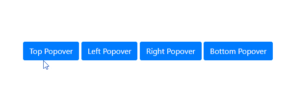
By default, the bootstrap popover will appear on the right side of the element. However, you can change the direction of the popover to top, left, right and bottom by using data-placement attribute.
The above example will return the result as shown below.
You need to remember that the placement of popovers will not work as expected if enough space is not available for them. For example, the top placement of the popover will display the bottom of the element if enough space is not available at the top.
By default, the popovers will close only when we click on the element again. To make popovers dismissible/close when losing the focus, or in other words, when clicking on the outside of the element or other element, you need to add data-trigger="focus" attribute.
The above example will return the result as shown below.

Similarly, you can use data-trigger attribute to open or display the popovers on element hover for that, you need to add data-trigger="hover" attribute to the respective element.
The above example will return the result as shown below.

In bootstrap, you can pass the different options to popover() method to customize the popover based on your requirements.
Following are the few important options which we can pass to popover() method in bootstrap.
| Name | Type | Default | Description |
|---|---|---|---|
| animation | boolean | true | It is useful to set the fade transition to the popover. |
| container | string | false | false | It is useful to append the popover to a specific element. |
| delay | number | 0 | It is useful to delay showing and hiding the popover (ms). |
| html | boolean | false | It is useful to allow HTML in the popover. |
| placement | string | 'top' | It is useful to specify the position of the popover. |
| title | string | '' | It is useful to set the popover text. |
| trigger | string | 'click' | It is useful to set how popover to trigger - click | hover | focus | manual. You can pass multiple triggers by separating them with space. |
| offset | number | string | 0 | It is useful to set the offset of the popover relative to its target. |
The above popover options can set either through the data attributes or JavaScript. Following is the example of passing the options through JavaScript to popover() method.
If you observe the above code, we are passing multiple options to popover() method by using JavaScript.
Same like above popover options, we have different popover() methods to show, hide, or toggle the popovers based on our requirements.
| Method | Description |
|---|---|
| .popover(options) | It is useful to attach popover options. |
| .popover('show') | It is useful to show the popover |
| .popover('hide') | It is useful to hide the popover |
| .popover('toggle') | It is useful to toggle the popover |
| .popover('dispose') | It is useful to hide and destroy the popover |
| .popover('enable') | It gives an element’s popover the ability to be shown. |
| .popover('disable') | It removes the ability for an element’s popover to be shown. |
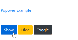
Following is the example of using popover() methods to show, hide, or toggle the popover based on the button clicks in bootstrap.
The above example will return the result as shown below.
In bootstrap, the popover classes have few events for hooking into popover functionality to fire the events during the showing or hide the popovers.
| Event | Description |
|---|---|
| show.bs.popover | This event will trigger before the popover is shown. |
| shown.bs.popover | This event will trigger after the popover is shown. |
| hide.bs.popover | This event will trigger before the popover is hidden. |
| hidden.bs.popover | This event will trigger after the popover is hidden |
| inserted.bs.popover | This event will trigger after the show.bs.popover event before the popover is shown. |
Following is the example of using the events to show the alert message while showing and hiding the popover in bootstrap.
This is how we can use the bootstrap popovers in our applications to show the HTML elements title and content attributes text on click/hover with a customized popup style based on our requirements.