The bootstrap has provided different types of classes to convey the information with different colors.
Following are the different types of handful classes available in bootstrap to convey the information through colors.
- .text-primary
- .text-secondary
- .text-success
- .text-danger
- .text-warning
- .text-info
- .text-light
- .text-dark
- .text-body
- .text-muted
- .text-white
- .text-black
These contextual classes are helpful to convey a meaningful message with colors. For example, if we use .text-success class, it will show the message in green color. Same way, if we use .text-danger class, it will show the message in red color.
Live Preview <div class="container">
<p class="text-primary">It's primary text message</p>
<p class="text-secondary">It's secondary text message</p>
<p class="text-success">It's success text message</p>
<p class="text-danger">It's danger text message</p>
<p class="text-warning">It's warning text message</p>
<p class="text-info">It's info text message</p>
<p class="text-light bg-dark">It's light text message</p>
<p class="text-dark">It's dark text message</p>
<p class="text-muted">It's muted text message</p>
</div>
The above example will return the result as shown below.

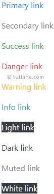
Bootstrap Text Colors on Hyperlinks
We can also use these text color classes on hyperlinks or anchor tags. These color classes will provide hover and focus states for anchor tags.
Following is the example of applying text color classes on anchor tags or hyperlinks in bootstrap.
Live Preview <div class="container">
<p><a href="#" class="text-primary">Primary link</a></p>
<p><a href="#" class="text-secondary">Secondary link</a></p>
<p><a href="#" class="text-success">Success link</a></p>
<p><a href="#" class="text-danger">Danger link</a></p>
<p><a href="#" class="text-warning">Warning link</a></p>
<p><a href="#" class="text-info">Info link</a></p>
<p><a href="#" class="text-light bg-dark">Light link</a></p>
<p><a href="#" class="text-dark">Dark link</a></p>
<p><a href="#" class="text-muted">Muted link</a></p>
<p><a href="#" class="text-white bg-dark">White link</a></p>
</div>
The above example will return the result as shown below.
In bootstrap, you can also add 50% opacity for white or black text with .text-white-50 or .text-black-50 classes like as shown below based on your requirements.
<div class="container bcontent">
<p class="text-black-50">Black text with 50% opacity</p>
<p class="text-white-50">White text with 50% opacity</p>
</div>
Bootstrap Background Color Classes
Like text color classes, we have background color classes in bootstrap to set the background color for elements.
The background color classes will not set the text color. To change the text color, you need to use both background and text color classes together.
Following are the different types of background contextual classes available in bootstrap to set the background for the elements.
- .bg-primary
- .bg-secondary
- .bg-success
- .bg-danger
- .bg-warning
- .bg-info
- .bg-light
- .bg-dark
- .bg-white
- .bg-transparent
These contextual classes are helpful to set the background color for the required elements. For example, if we use the .bg-success class, it will set the green background color. Similarly, if we use the .bg-danger class, it will set the red background color for an element.
Live Preview <div class="container bcontent">
<p class="bg-primary text-white">Primary Background</p>
<p class="bg-secondary text-white">Secondary Background</p>
<p class="bg-success text-white">Success Background</p>
<p class="bg-danger text-white">Danger Background</p>
<p class="bg-warning text-dark">Warning Backgroun</p>
<p class="bg-info text-white">Info Background</p>
<p class="bg-light text-dark">Light Background</p>
<p class="bg-dark text-white">Dark Background</p>
<p class="bg-white text-dark">White background</p>
<p class="bg-transparent text-dark">Transparent background</p>
</div>
The above example will return the result as shown below.

This is how we can use the text or background color classed in bootstrap to set the text color or background color of elements.